The Quebec Food Retailer Association
Logo (re-design) + Stationery Package
—
—
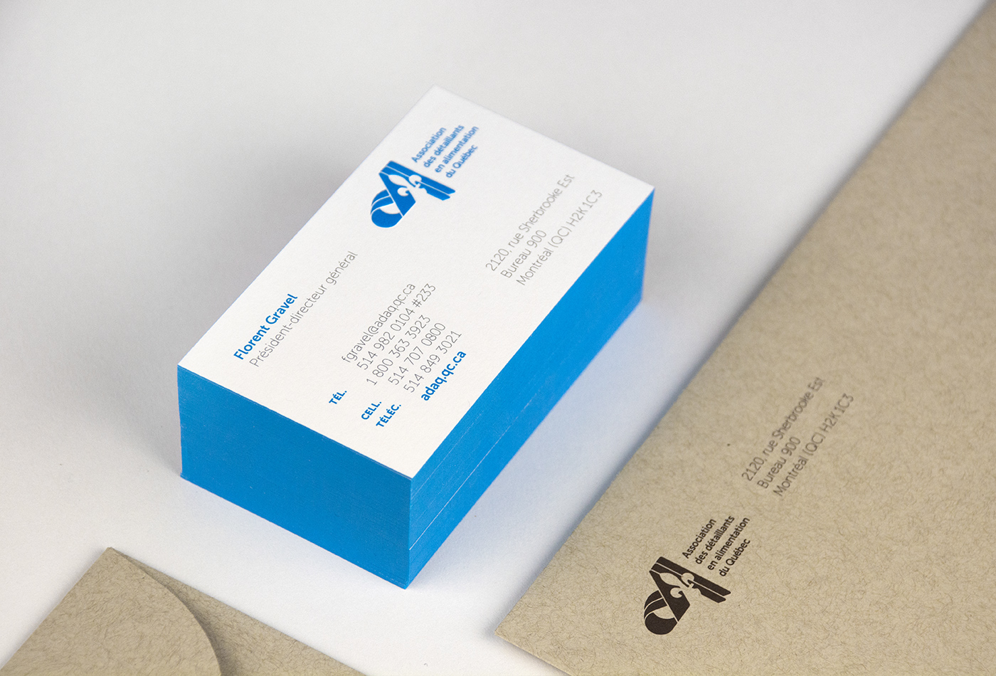
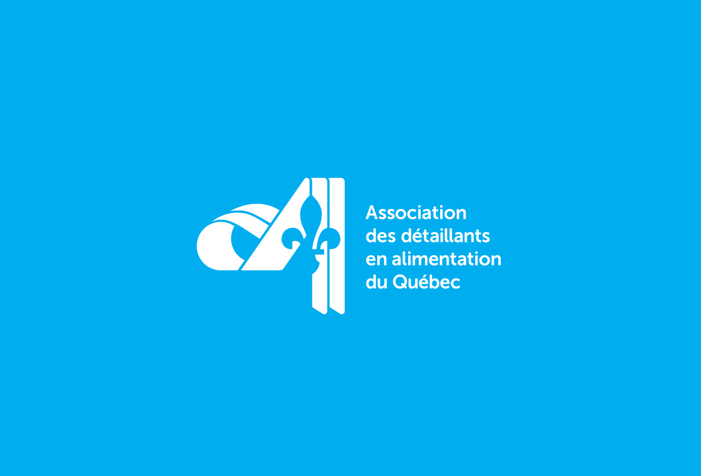
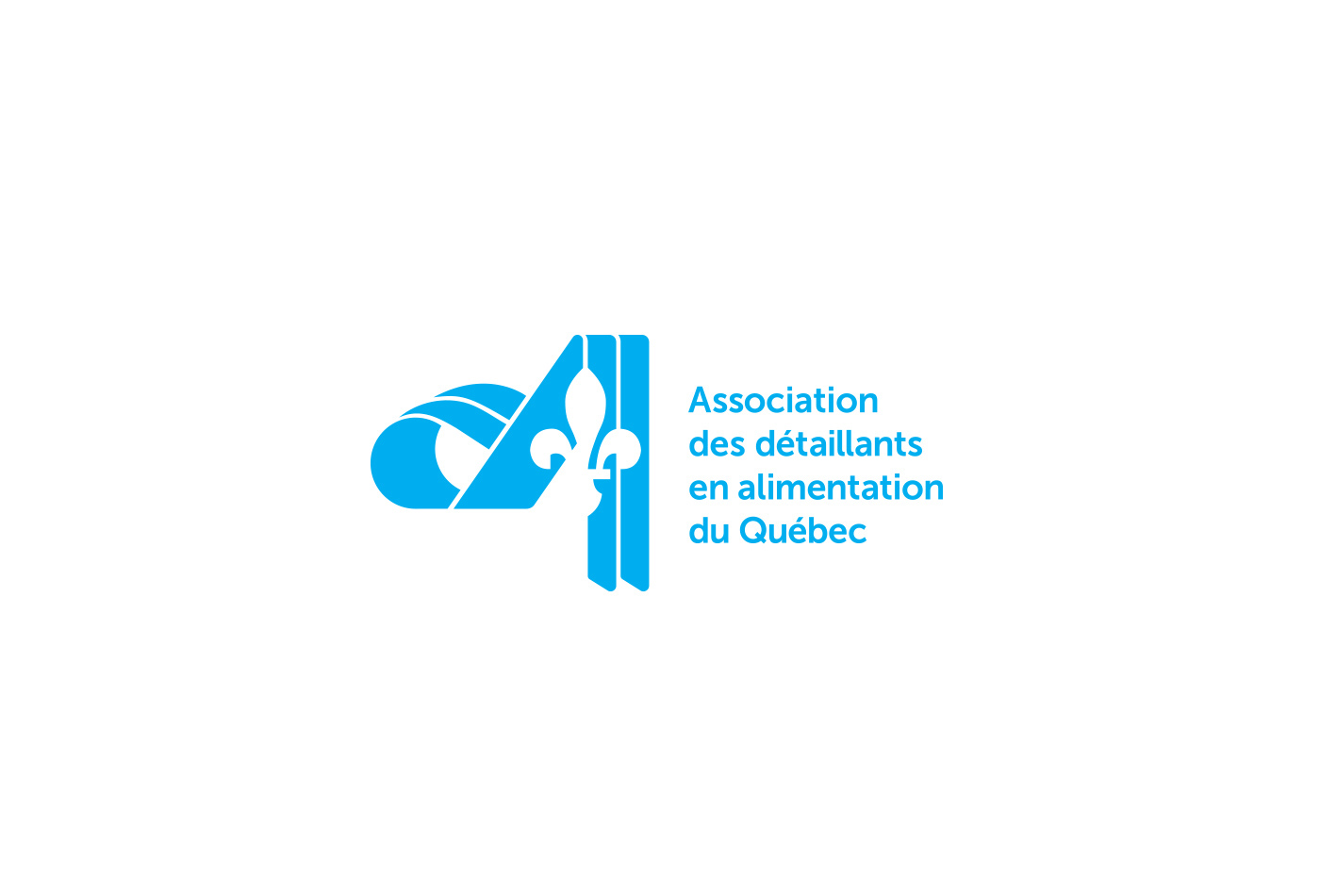
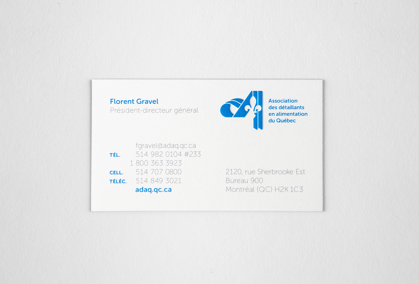
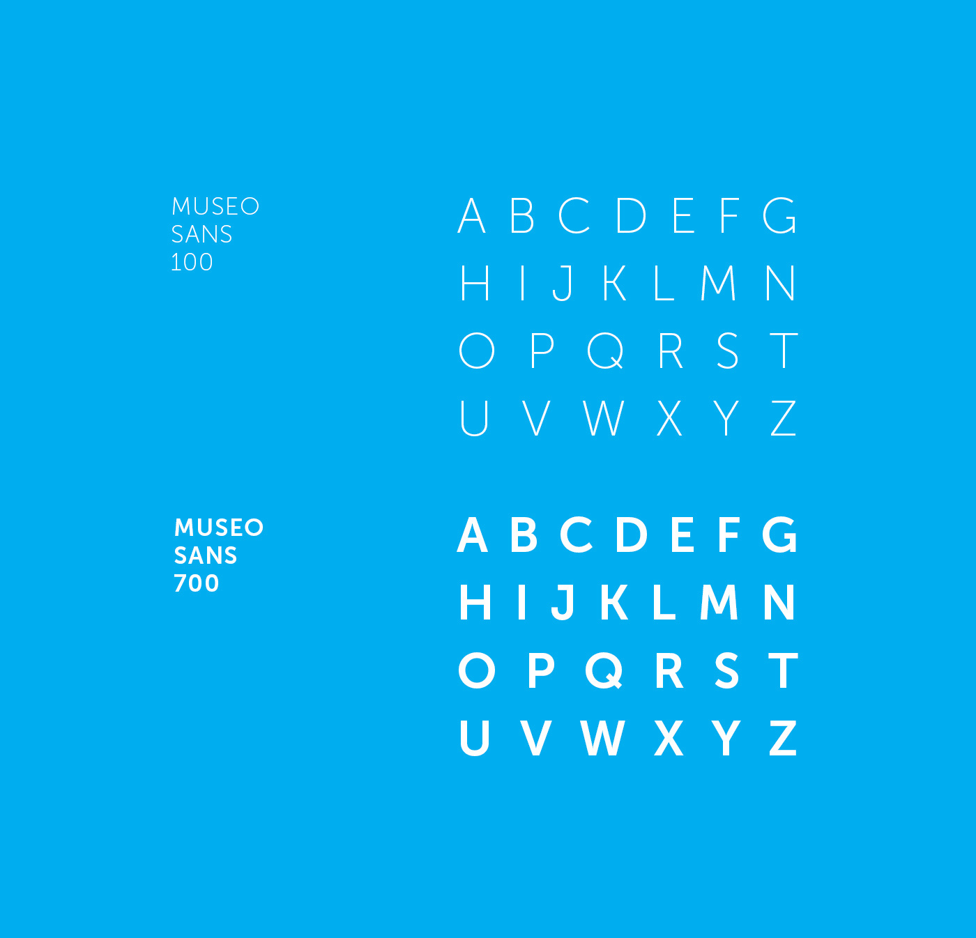
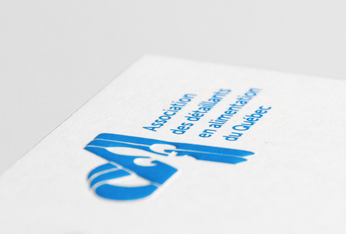
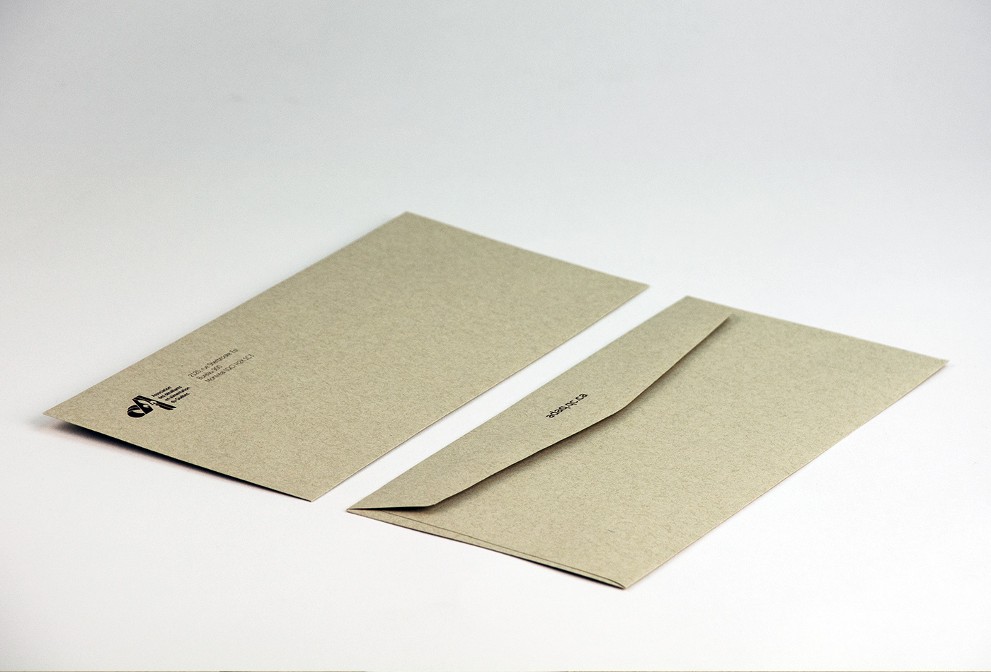
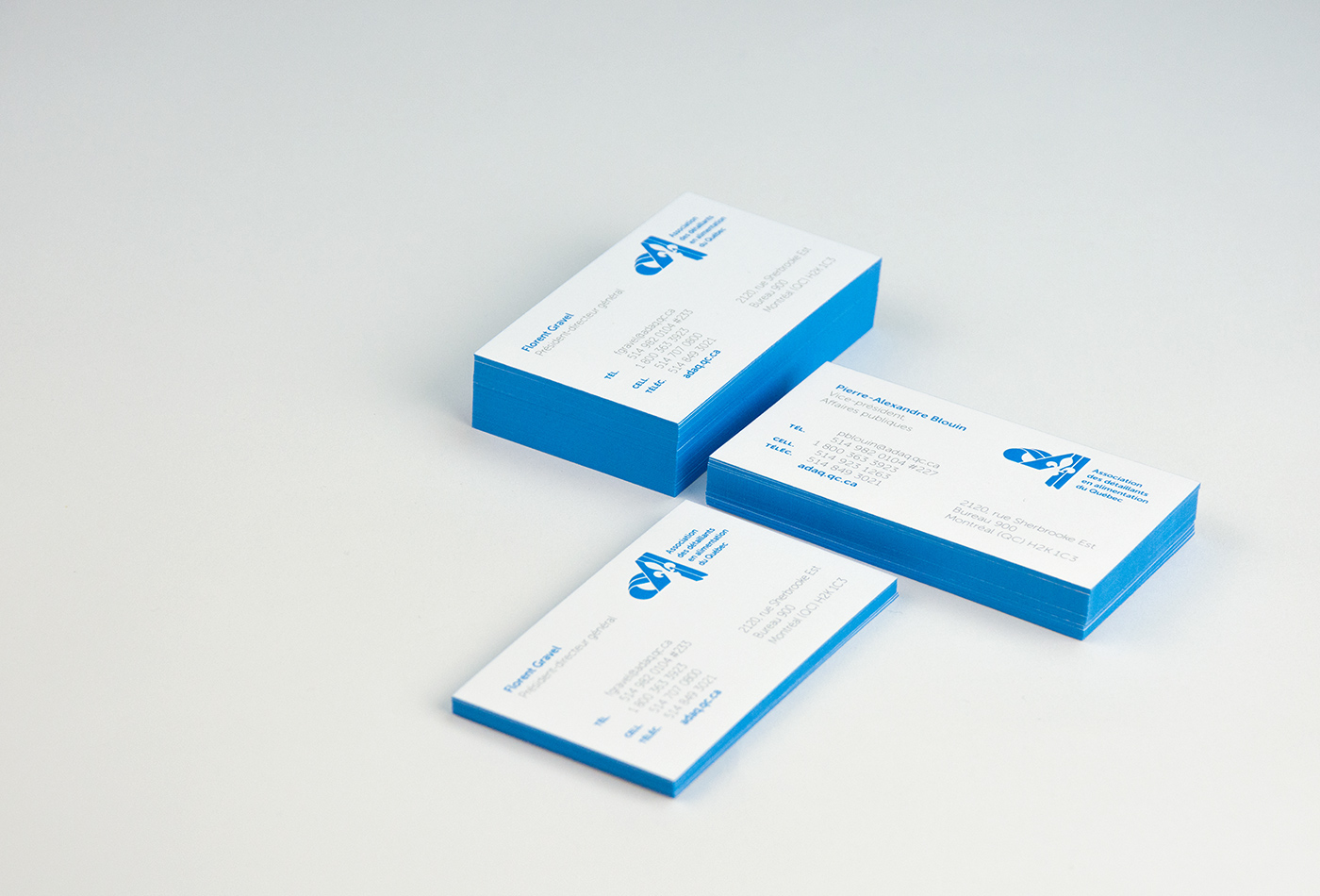
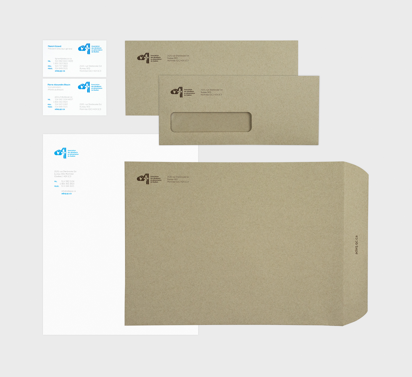
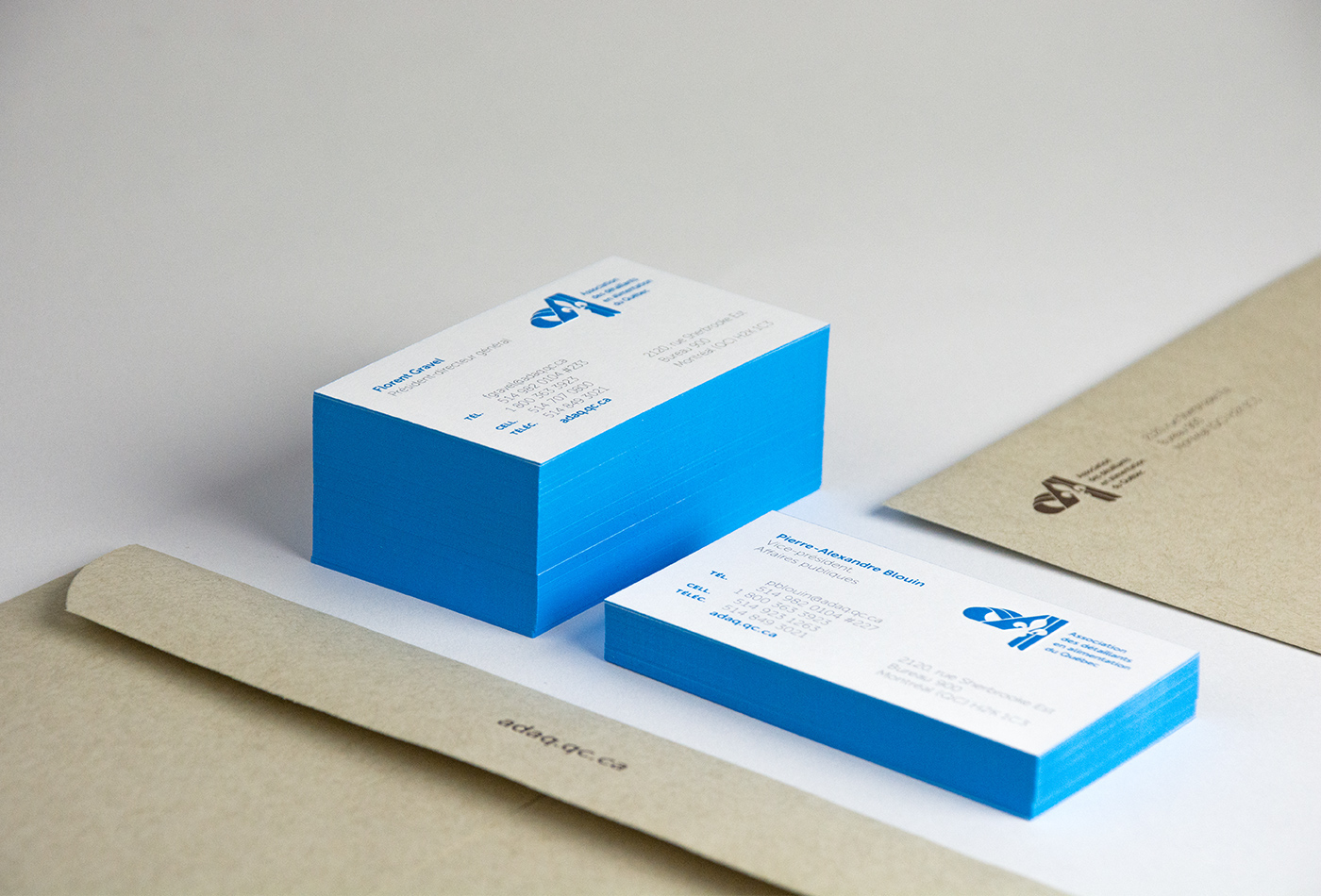
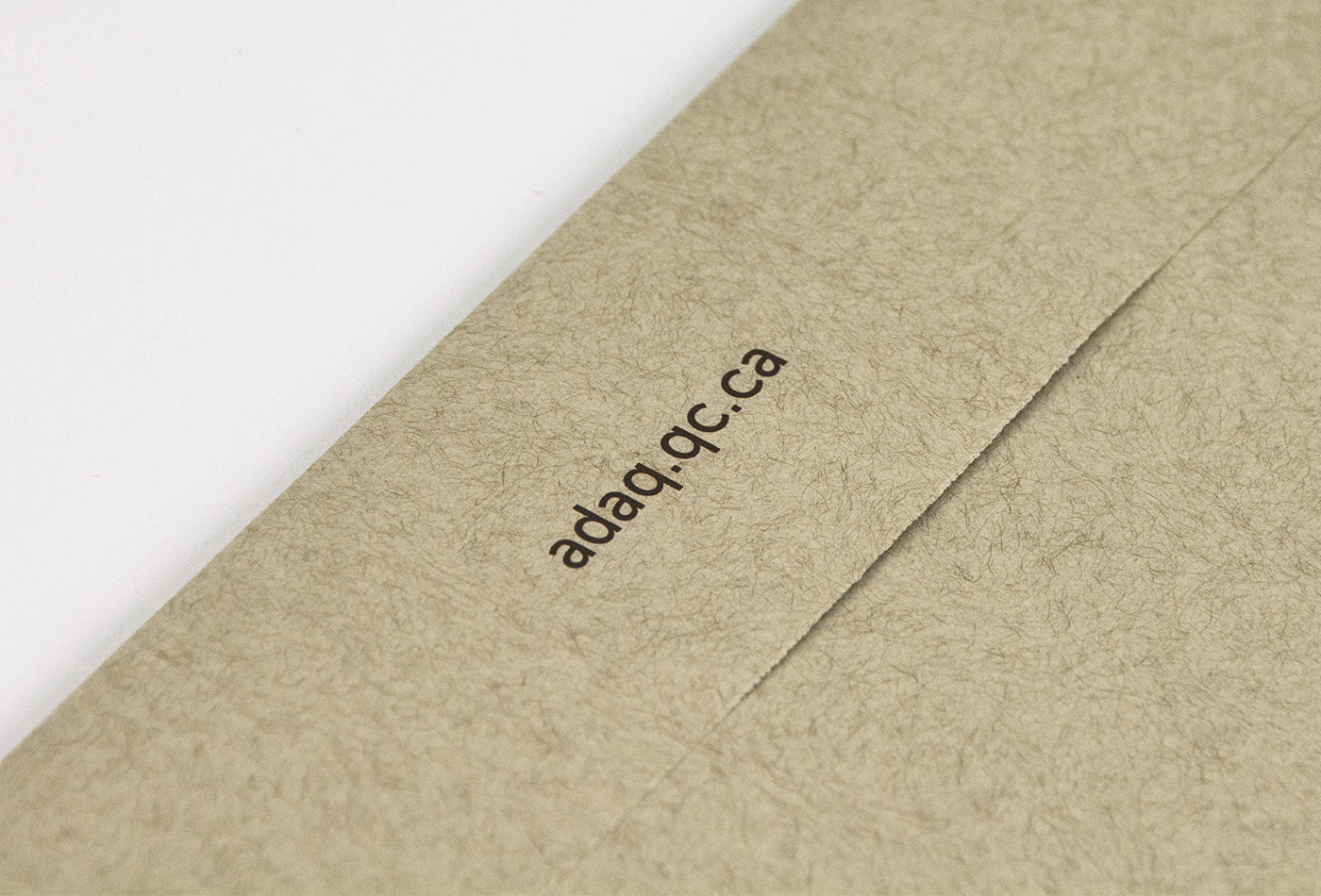
The well-established logo/symbol for The Quebec Food Retailer Association (ADA) has been recognized by its industry for more than 20 years. Unfortunately, at the time it was developed, it was not created with high standards of quality it deserved. The ADAQ awarded me the mandate to re-design their corporate identity and develop a new stationery package. I refined the original symbol to make the “fleur de lyse” more defined and better integrated into the original monogram. The main font was changed to modernise the overall feel of the brand and to provide better integration in the stationery update. A new brand colour palette uses classic corporate white, a fresh cyan, and for the envelope, a retro kraft brown inspired by 'old school' paper grocery bags, giving the brand special meaning.